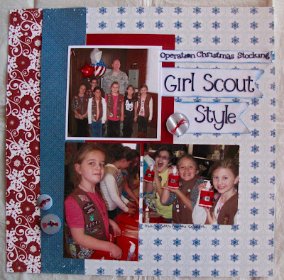
When I created this layout, at first I did not ink the banners. Though I liked the design of the page, the layout seemed to be missing something. Finally, I decided to lift the banners
(Sorry Lisa! Every time I lift something off the page - I think of you cringing at me! LOL) and ink the edges. With that small finishing touch - the layout transformed into something so much better! Sometimes - it is in the details!
The fabulous sketch I followed for this layout is a current challenge at
Sketch-N-Scrap. Here is the sketch:
:

Join me on this fun sketch challenge! Links close on November 30th.
Materials Used: Echo Park - Winter Park papers, cardstock, Cricut - Alphalicious font, buttons, ink, and embroidery floss.


I LOVE the banners!!! What a nice touch! I can see why you pulled them up to ink but good thing I wasn't there I would have had to leave the room or have another glass of wine lol!!!! Another amazing layout for your books!!! Thanks for joining us at Sketch N Scrap!
ReplyDeleteSuper cute layout! Thanks for joining us at Sketch N Scrap!
ReplyDeleteThis is a great layout and the ink on the banners really make them pop! Thanks so much for sharing with us at Sketch N Scrap!
ReplyDeleteLove your cute layout and the banner pieces! Nice touch! Thanks for joining us at Sketch N Scrap!
ReplyDeleteSuper cute layout! Love the banners! Thanks for joining us at Sketch N Scrap!
ReplyDeleteWonderful take on the sketch. Love the colors. Thanks so much for joining us at Sketch N Scrap
ReplyDeleteCute layout! Thanks for joining us at Sketch N Scrap.
ReplyDeleteSurama